These four dashboards come from HealthBot, an open-source monitor that checks an online store every few minutes: whether a shopper can get through checkout, whether a set of pages answer, how fast the site responds, and how many people are on it.
Every screenshot here is from a demo run on invented data: a made-up store, made-up traffic and made-up deploys, with failures thrown in on purpose. The numbers mean nothing. What each dashboard is built to answer is the point.
A dashboard earns its place by answering a question someone asks under pressure, and by backing an alert that tells them when to ask it. So each one below says which question, and which alert.
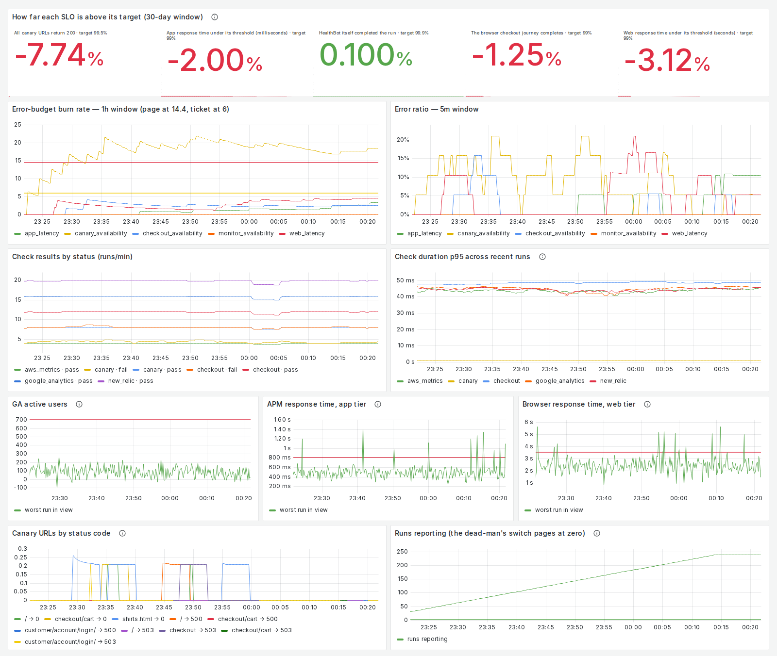
Is each objective being met?
The question: for each thing customers rely on, such as checkout completing or pages answering, is it meeting its target over the last 30 days, and how fast is it using up its allowance for failure right now? The alert behind it: a page when an objective burns its budget 14.4 times too fast over an hour, confirmed over five minutes, and a ticket when it burns 6 times too fast over six hours, confirmed over thirty minutes.
Open the full-size image
Worth noticing:
- The top row says how far each objective is above its target, not its raw percentage. Zero is exactly on target, so the sign is the verdict.
- The burn chart draws both thresholds on it, but only one applies. It shows the one-hour rate, so only the page line applies to it; a ticket is decided by the six-hour rate, which this chart doesn’t draw.
- “Runs reporting” is the monitor’s own pulse. If it stops reporting altogether, a separate alert pages, because a monitor that has gone quiet looks exactly like a store with nothing wrong.
If burn rates are new to you, the reliability calculator works them out for your own numbers.
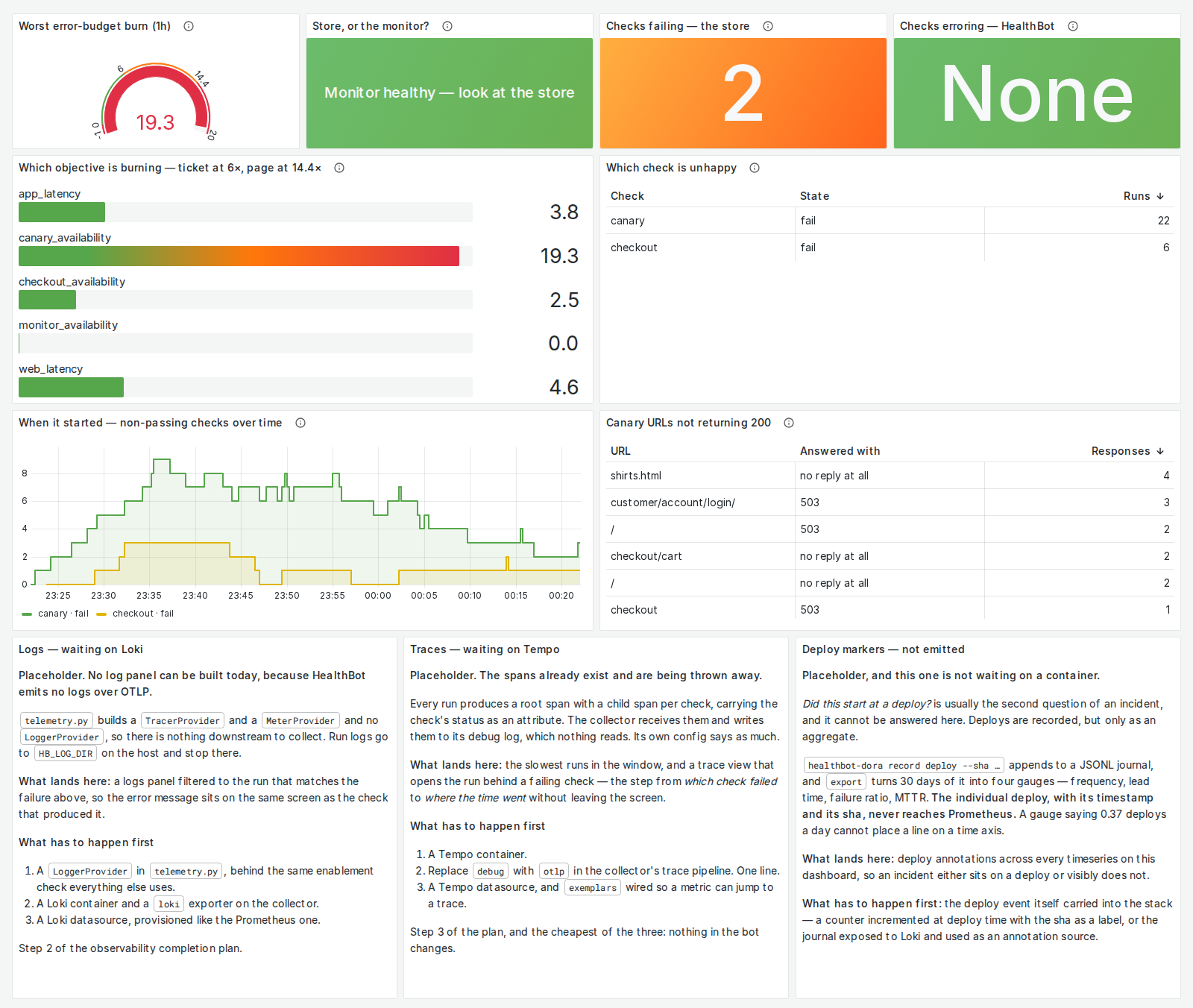
When something is wrong, what is it?
The question: is the problem the store or the monitor, which check is unhappy, which objective is burning, and since when? The alert behind it: the same page. The dial and the bars show the one-hour burn against the page line, so nobody has to remember 14.4 mid-incident; the 6 mark is the ticket’s rate, drawn for reference only, since a ticket is decided over six hours.
Open the full-size image
Worth noticing:
- “Store, or the monitor?” comes first. A run that crashes says nothing about the store, so the monitor’s own failures are counted apart from the store’s.
- An empty table says so in words. Only unhappy checks appear, so empty is the healthy state, and a blank panel would look broken.
- Gaps in the timeline are left as gaps. A stretch with no runs is not a stretch with no failures, and drawing a line across it would invent data.
- Three panels are placeholders, and say what they’re waiting for: logs, traces and deploy markers. A missing panel that says why is more honest than a dashboard that looks complete.
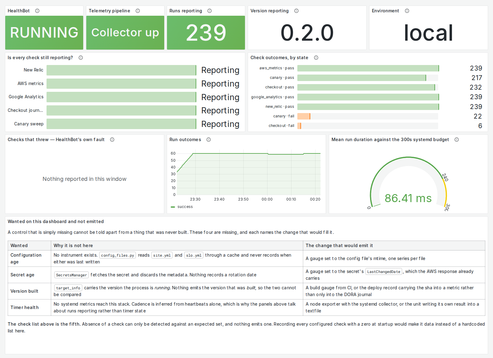
Is the monitor itself working?
The question: is the monitor running, is every check still reporting, and is each run finishing inside its time limit? The alert behind it: the same silence alert, which pages when the monitor stops reporting at all.
Open the full-size image
Worth noticing:
- “Is every check still reporting?” lists the checks by name. A check that has stopped running looks exactly like one that passes, unless something names the checks that ought to be there.
- A check that errors is counted apart from one that fails. A failure is a verdict about the store; an error is a bug in the monitor.
- Run time is drawn against its limit. A run past the limit is killed and recorded as a failure, so the headroom is the number that matters.
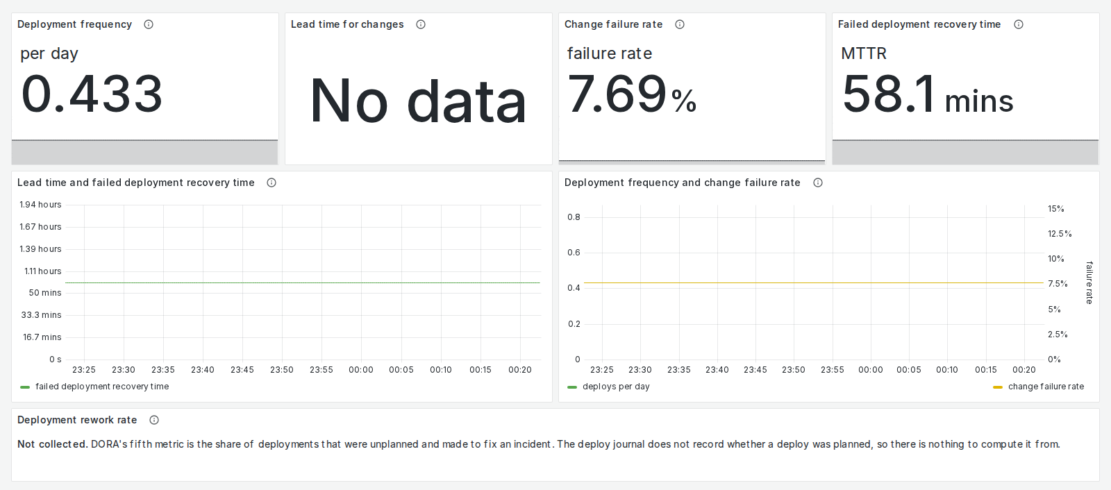
How is delivery going?
The question: how often do we deploy, how long from a commit to production, how often does a deploy need fixing, and how long does recovery take? These are four of the DORA metrics, the measures of software delivery from the DORA research programme. The alert behind it: none. This is a board for trends, not for an incident.
Open the full-size image
Worth noticing:
- There are no “elite” or “low” badges. Each metric is shown as a trend over time, with no performance tier attached.
- In this demo, lead time reads “No data”. The invented deploys carry no commits to measure from, and the panel says so rather than drawing a zero.
- The fifth DORA metric has a panel that explains why it is missing. Rework rate needs to know whether a deploy was planned, and the deploy record doesn’t say.
Building your own
- Start from the question, not the data. Write down what someone will ask at 3 a.m., and build the panel that answers it.
- Put the alert’s threshold on the chart of the window the alert reads. Nobody should have to remember 14.4 during an incident, and a line drawn on the wrong window teaches the wrong trigger.
- Make empty and missing look different from healthy. Say so in words.
- Watch the watcher. A monitor that goes quiet should page as loudly as the thing it monitors.